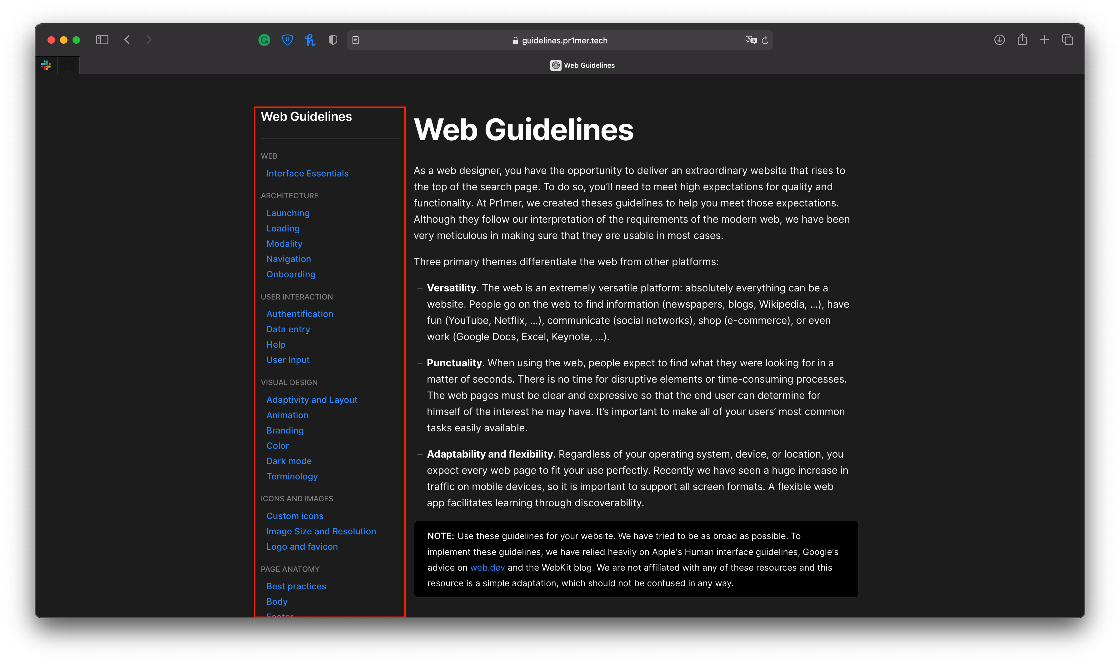
Sidebars
On larger displays, a sidebar provides app-level navigation and quick access to top-level collections of content in your website. Selecting an item in the sidebar allows people to navigate to a specific piece of content. A sidebar can be used in combination with a navigation bar and a footer, but avoid putting too much links. You can also use the sidebar in your UI to include all your buttons and options, like in Pages or Keynote for example.
 But using a sidebar can be an expensive choice in development time when you need to adapt your site on mobile. Reserve the sidebar for the interfaces where it makes sense to optimize the time you spend on your website.
Use a sidebar to organize information at the website level. A sidebar is a good way to flatten your information hierarchy and provide access to several peer information categories or modes at the same time. Use a sidebar for quick navigation to the key parts of your site or top-level collections of content like pages and important categories.
Use the sidebar to add controls. In a web app, when you're not trying to organize information, use the sidebar to give users a convenient way to access the tools they need.
Use titles to form logical groupings of related items. The sidebar should be an organized and clear space, use titles (as on this site) to organize the sections into categories.
Keep titles in the sidebar clear and concise. Omit unnecessary and redundant words.
In general, refrain from exposing more than two levels of hierarchy within a sidebar. When a data hierarchy is deeper than two levels, consider organizing your information in multiple pages, or use modals.