Typography
Text represents more than 90% of all information on the web. Typography is a cornerstone of web experience. Even here, the words written in this page are visible simply because of typography. When it comes to typography design, it’s vital not only to make the text legible and readable but also to convey a certain mood. A compelling typography is key to every website.
 Communication plays a vital role in design. In order to be successful, your products have to communicate their intent and purpose clearly. Typography helps design to deliver information to people. Font size, font width, font color, and line lengths — all elements of typography work together to create a great user experience.
Avoid using three or more font families. Using more than two font families simultaneously can make your layout look busy. Using three font families isn't recommended, using more is strictly forbidden unless you have a very good reason (ex: Font website).
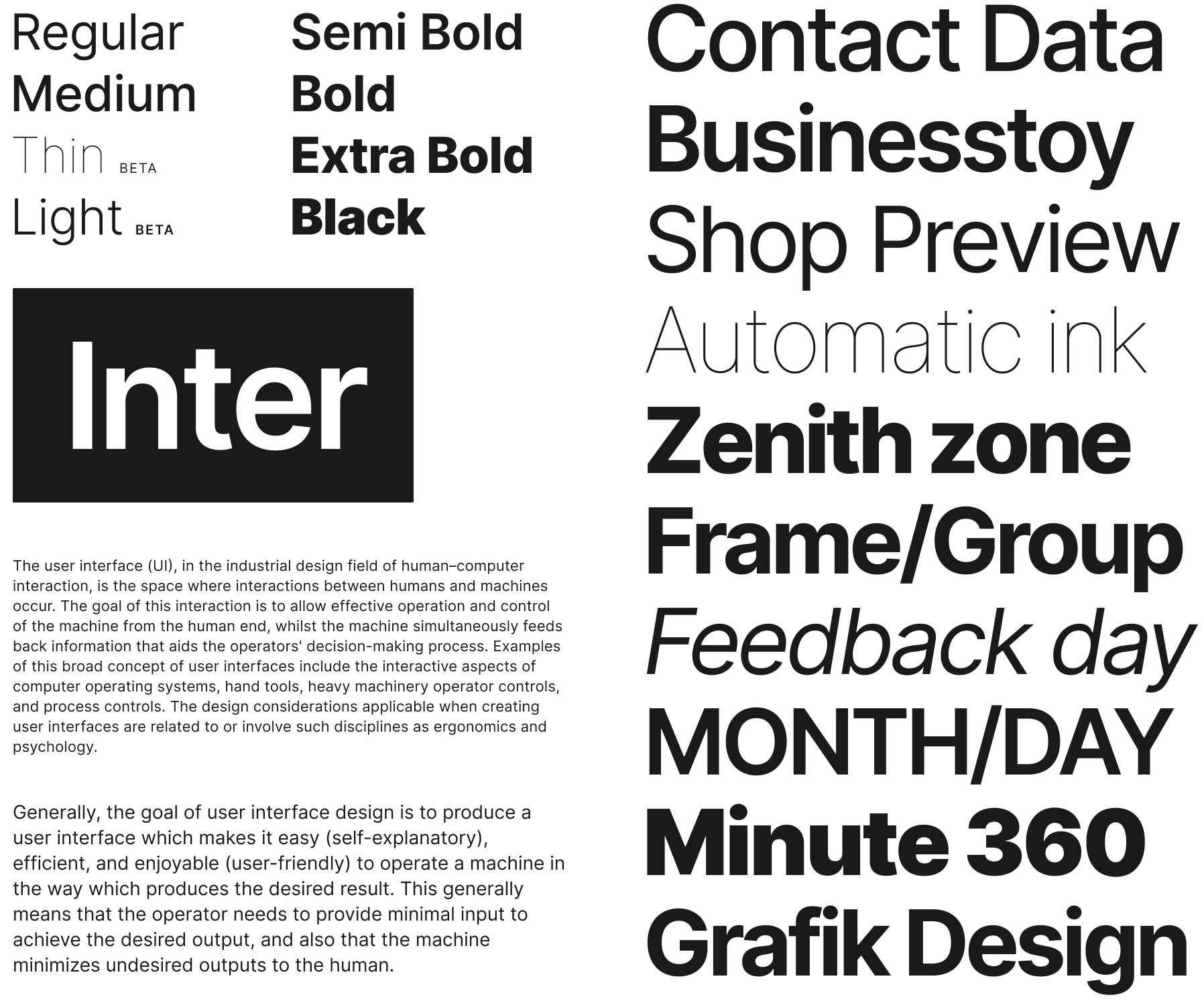
Start by selecting a typeface for your body text. The typeface you choose to use for body text will affect the decisions of any other typeface in your design. Select typeface for headlines only after you will be confident with a typeface for body text.
Always prefer native fonts to custom fonts. Users are familiar with the fonts on their systems, so it's always best to use a system font that is neutral.
Use the following code to use system fonts in your site:
body {
    font-family:
        -apple-system,
        BlinkMacSystemFont,
        Segoe UI,
        Roboto,
        Oxygen,
        Ubuntu,
        Cantarell,
        Fira Sans,
        Droid Sans,
        Helvetica Neue,
        sans-serif;
}
Make sure that the selected fonts work well together. The font families you select should complement each other. Tools like FontPair or TypeWolf can simplify the process of finding the right font combination.
Avoid creating images with text. The text becomes unmanageable—it becomes hard to quickly adjust the typographic system because you need to change the images too. Instead, it’s better to use text positioned over the image using CSS style property.
Use the platform's anti-aliasing. Not all platforms render fonts the same way. That's why design tools like Figma implement their own anti-aliasing. Developers should expect small differences in font rendering across platforms.