Image Size and Resolution
The coordinate system most browser use to place content onscreen is based on measurements in points (which are called pixels in CSS, but they’re not real pixels), which map to pixels in the display. A standard-resolution display has a 1:1 pixel density (or @1x), where one pixel is equal to one point. High-resolution displays have a higher pixel density, offering a scale factor of 2.0 or 3.0 (referred to as @2x and @3x). As a result, high-resolution displays demand images with more pixels.
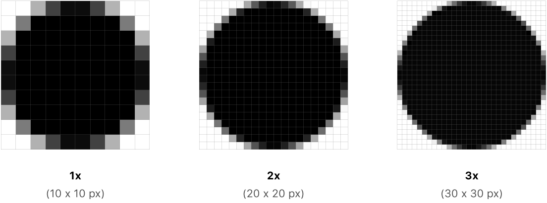 For example, suppose you have a standard resolution (@1x) image that's 100px × 100px. The @2x version of this image would be 200px × 200px, and the @3x version would be 300px × 300px.
Use the srcset property to display high definition images. This allows you, the developer, to specify higher-quality images for your users who have high-resolution displays, without penalizing the users who don’t. Importantly, it also provides a graceful fallback for browsers that don’t yet support the feature. It will also help you save bandwidth. Use the srcset attribute like this:
<img src="normal-image.jpg" srcset="better-image.jpg 2x" />Notice the “2x” after “better-image.jpg”? That tells the browser that if you’re on a display with two or more device pixels per CSS pixel, it should use “better-image.jpg” instead of “normal-image.jpg”. And if you’re not on a high-resolution display, the browser will fall back to the value specified in src.
Designing High-Resolution Artwork
Produce art at the largest size you need and scale it down for smaller sizes. It’s easiest to design a detailed image at a large size and reduce the level of detail, if necessary, at smaller sizes.
Use an 8px-by-8px grid. A grid keeps lines sharp and ensures that content is as crisp as possible at all sizes, requiring less retouching and sharpening. Snap the image boundaries to the grid to minimize half pixels and blurry details that can occur when scaling down.
Always preview high-resolution images at lower resolutions. If you’re not satisfied with how your high-resolution images look when scaled down, redraw and preview the art again.
Serving images
Serve images in next-gen formats. Use the <picture>, <source>, and <img> tags to provide your assets in next-gen (WebP) formats and standard formats (PNG, JPEG).
Compress your images. Try never to exceed 1 mb when serving an image. If this is not the case, reduce the resolution or use stronger compression. Try to find the right balance between quality and weight. Your site must be fast to load, images add considerable weight.
Wherever it’s possible, prefer serving vector graphics to images. When displaying illustrations or glyphs, prefer using the SVG format instead of regular images.