Dark mode
In modern operating systems, users can choose to adopt a dark system-wide appearance instead of a light appearance. In Dark Mode, the system adopts a darker color palette for all windows, views, menus, and controls. The system can also uses more vibrancy to make foreground content stand out against the darker backgrounds. Your website visual appearance can dynamically change according to the system current state.
Dark Mode Behaviours
By default there are no behaviour changes with how pages look when a user is in dark mode. This preserves the standard assumptions web designers have had for almost thirty years — that a page defaults to a white background and black text. Not all web content is simple. For this reason most browsers do not auto-darken web content — documents will need to opt-in to dark mode. The main way to signal that your content supports dark mode it to adopt the new color-scheme style property.
You would use this inherited property in your stylesheet like this:
:root {
    color-scheme: light dark;
    --special-text-color: hsla(60, 100%, 50%, 0.5);
    --border-color: black;
}

@media (prefers-color-scheme: dark) {
    :root {
        --special-text-color: hsla(60, 50%, 70%, 0.75);
        --border-color: white;
    }
}

.special {
    color: var(--special-text-color);
    border: 1px solid var(--border-color);
}
Specifying the values light and dark on the root element lets the engine know both modes are supported by the document. This changes the default text and background colors of the page to match the current system appearance. Also standard form controls, scrollbars, and other named system colors change their look automatically. Without this declaration, it would not be safe for the engine to use dark form controls or a dark color scheme, since many documents are designed with an assumed light color scheme.
Focus on your content. Dark Mode puts the focus on the content areas of your interface, allowing that content to stand out while the surrounding chrome recedes into the background.
Dark Mode is an aesthetic choice for users. Users can choose Dark Mode as their default interface style, and may use it at any time of day or in any lighting conditions.
Colors
The color palette in Dark Mode includes darker background colors and lighter foreground colors. These colors aren’t necessarily an inversion of their light counterparts. While many colors are inverted, some are not. For example, both light and dark appearances use dark lines to create visual separations between views.
Ensure sufficient color contrast in all appearances. For foreground and background colors, strive for a contrast ratio of 7:1. This ratio ensures that your foreground content stands out from the background. It also ensures that your content meets more stringent accessibility guidelines. At a minimum, make sure the contrast ratio between colors is no lower than 4.5:1.
Soften the color of white backgrounds. If you must use a white background for your content in Dark Mode, choose a slightly darker white that prevents the background from glowing against the surrounding dark content.
Images, Icons, and Glyphs
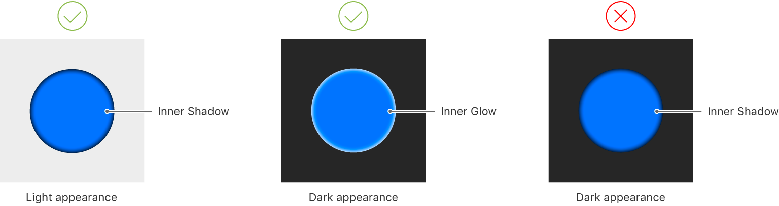 Design individual glyphs for light and dark appearances when necessary. A glyph that uses a hollow outline in light mode might look better as a solid, filled shape in Dark Mode.
Make sure full-color images look good. Use the same asset if it looks good in both light and dark appearances. If an asset looks good in only one appearance, modify the asset or create separate light and dark assets. As mentioned before, you can use the prefers-color-schemes media query in <picture> elements or style rules to select a different image if you have a dark mode version. For example:
<picture>
    <source srcset="mojave-night.jpg" media="(prefers-color-scheme: dark)" />
    <img src="mojave-day.jpg" />
</picture>