Color
Color is a great way to provide status information, give feedback in response to user actions, and help people visualize data or make decisions. Color indicates which elements are interactive, how they relate to other elements, and their level of prominence. Important elements should stand out the most.
Use color judiciously for communication. In general, color should be used sparingly, like when you need to call attention to important information. For example, a red triangle that warns people of a critical problem becomes less effective when you use red elsewhere for noncritical reasons.
Consider how your use of color might be perceived in other countries and cultures. In some cultures, for example, red communicates danger. In others, red has positive connotations. Make sure the colors in your site send the correct message.
Avoid using colors that make it hard for people to perceive content in your site. For example, colorblind people might not be able to distinguish some color combinations, and insufficient contrast can cause icons and text to blend with the background and make content hard to read.
Consider how nearby artwork and translucency affect colors. Color can lose its impact when composited over a non-neutral or translucent background, or when used adjacent to a very bright, colorful image.
Test your site’s color scheme under a variety of lighting conditions. Lighting varies significantly based on room ambiance, time of day, and more. Colors you see on your computer at design time won’t always look the same when using your site in an environment with bright ambient light conditions. Always preview your site under multiple lighting conditions, including outdoors with a laptop on a sunny day, to see how colors appear. Adjust colors to provide the best possible viewing experience in the majority of use cases.
Color management
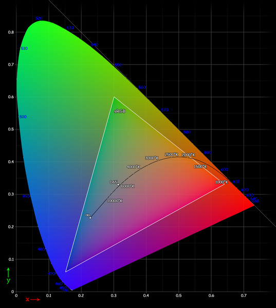
Apply color profiles to your images. Color profiles help ensure that your site's colors appear as expected on different displays. The Standard RGB (sRGB) color space produces accurate colors on most displays.
Use wide color to enhance the visual experience on compatible displays. Wide color displays support a P3 color space, which can produce richer, more saturated colors than sRGB. As a result, photos and videos that use wide color are more lifelike, and visual data and status indicators that use wide color are more meaningful. When appropriate, use the Display P3 color profile at 16 bits per pixel (per channel) and export images in PNG format. Note that a wide color display is needed to design wide color images and select P3 colors.
Here is how to define Display-P3 colors:
/* sRGB color. */
:root {
    --bright-green: rgb(0, 255, 0);
}

/* Display-P3 color, when supported. */
@supports (color: color(display-p3 1 1 1)) {
    :root {
        --bright-green: color(display-p3 0 1 0);
    }
}

header {
    color: var(--bright-green);
}